Maximizing Brand Impact Through Smart Logo Placement & Design
Whether it’s on a hoodie, a tumbler, or a tiny pen, your logo must always look sharp, feel intentional, and speak for your brand without saying a word.
Team Bulk Pro
8/5/20253 min read
My post content
Maximizing Brand Impact Through Smart Logo Placement & Design
In a world where attention is currency, your logo isn’t just a symbol—it’s a visual handshake with your audience. Whether it’s on a hoodie, a tumbler, or a tiny pen, your logo must always look sharp, feel intentional, and speak for your brand without saying a word.
In this quick guide, we’ll break down the essentials of:
Logo placement across popular print items
Design quality and pixel standards
Color combinations that stick
Strategic design choices that boost brand recognition
1. Smart Logo Placements Across Printed Products
Designing for physical products isn’t the same as digital. Each item has its own shape, material, and space constraints. Here's how to make your logo work across the board:
T-Shirts & Hoodies
Left Chest: A classic and clean choice. Subtle, professional, and widely used for corporate or branded apparel.
Center Chest: Bold and high-visibility. Great for promotional events or streetwear vibes.
Sleeves or Back: Offers a secondary branding spot—ideal for minimalist front designs.
Tumblers & Bottles
Vertical Alignment: On narrow tumblers or bottles, a vertical logo centered along the side looks modern and makes good use of limited space.
Wrap-Around Design: For full custom prints, wrap your logo with brand elements (tagline, icon, or pattern) to create a 360° experience.
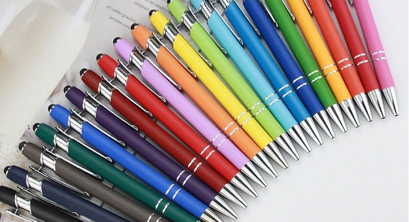
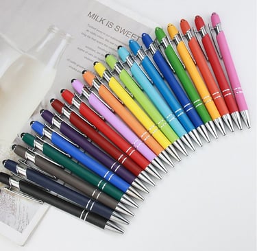
Pens (Engraving or Print)
Side Barrel Placement: Since space is minimal, use a simplified logo or just your brand mark (icon). Horizontal alignment is best.
Monochrome Design: For engraving, stick to single-color or black-and-white versions to maintain clarity.
General Printing (Flyers, Posters, Brochures)
Top Left or Bottom Right: Readers’ eyes naturally gravitate to these areas.
Footer Placement for Documents: A subtle yet consistent presence on letterheads or reports.
Tip: Always test placements using mockups before final printing. What looks centered on-screen might not align visually once printed and curved (like on a tumbler or pen).
2. Design Quality: Why 300 DPI is the Gold Standard
When printing, resolution matters. Pixelated logos scream unprofessional.
300 DPI (dots per inch) is the industry standard for high-quality printing. It ensures your logo looks sharp, clean, and professional on all materials.
Avoid stretching logos or using low-res images from websites (usually 72 DPI).
Use vector formats like SVG, AI, or EPS whenever possible. Vectors scale infinitely without losing quality—perfect for any print size from pens to banners.
Remember: A logo designed in high resolution once can be used forever. It’s a one-time investment that pays off across every print touchpoint.
3. Color Combinations That Stand Out (and Still Match Your Brand)
Colors do more than decorate—they communicate. The right palette reinforces your brand personality and grabs attention.
Popular & Effective Combos:
Black & White: Minimalist and versatile. Great for engraving, pens, and apparel.
Blue & Orange: A high-contrast mix that feels energetic yet trustworthy.
Navy & Gold: Premium, elegant, and classic—ideal for luxury or high-end branding.
Monochromatic Schemes: Offer sophistication and consistency across print mediums.
Pro Tip: Always use Pantone (PMS) colors for physical printing when exact matches matter. RGB/Hex values are for screens—PMS ensures your brand colors look the same on shirts, mugs, and business cards.
Consider material contrast too: A light logo may disappear on a white hoodie or tumbler. Always test against the actual background color and texture.
4. Design Strategies for Maximum Impact
Whether you’re printing on fabric, metal, or paper, your design should always reflect a clear strategy:
Keep It Simple: Intricate details can get lost on small items like pens or embroidery patches. Use clean lines and bold shapes.
Be Consistent: Use the same logo version, colors, and placement rules across products to create a unified brand experience.
Design Variations: Have horizontal, vertical, icon-only, and monochrome versions of your logo ready for different printing needs.
Mock It Up: Before you print in bulk, visualize your design on real-world mockups. What works on a screen may not work on cotton or stainless steel.
Final Thoughts
Your logo doesn’t just represent your business—it travels with it. From a hoodie to a pen, each print product is a chance to extend your brand's reach and leave a lasting impression. By mastering placement, prioritizing high-res design (300 DPI or vector), choosing smart color combos, and building a flexible yet consistent design strategy, you’re setting your brand up for real-world visibility and long-term impact.
Great design isn’t optional—it’s your brand’s handshake in every form. Make it count.
About Us
Support
Subscribe to Newsletter
Email: support@bulkpromotion.ca
© 2025 Bulk Promotion. All Rights Reserved.
Serving Provinces
Alberta, British Columbia, Manitoba, New Brunswick, Newfoundland and Labrador, Nova Scotia, Ontario, Prince Edward Island, Quebec, Saskatchewan, Mississauga, Oakville, Vaughan, Markham, Richmond Hill, Scarborough, Brampton, Etobicoke, North York, Toronto (Greater Toronto Area) , Caledon, Milton, and Burlington.
A Division of 1000189928 Ontario Inc.
Tel: 1-289-388-7877